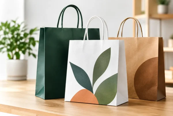
A carrier bag has only a few seconds to make an impression: at the till, on the pavement, in a café queue or when a customer opens a delivery. Good bag artwork makes those seconds count. It turns a necessary packaging item into a recognisable part of your customer experience, while still working for the practical job of carrying, protecting or presenting the product.
For UK businesses, the strongest designs are not always the busiest. They are the ones that remain clear on the chosen material, suit the bag format and can be reproduced consistently across an order. Getting the artwork right before production also avoids delays, unnecessary amendments and costly compromises later.
Start bag artwork with the bag itself
Artwork should never be developed in isolation. A design that looks sharp on a laptop screen may be too fine, too dark or too detailed once printed onto kraft paper, a flexible plastic carrier bag or a textured cotton tote.
Begin with the questions that affect the finished product. What will the bag carry? How far will customers carry it? Is it for a single retail purchase, a food takeaway, an e-commerce dispatch or repeated use? A boutique paper bag may prioritise presentation and a premium feel. A mailing bag needs clear branding without interfering with labels and address information. A bag for life needs artwork that remains appealing after repeated handling.
The material also changes what is possible. White plastic provides a clean background for bold colours and fine detail. Natural kraft paper gives a more organic appearance, but its base colour becomes part of the design. A pale ink may look different on brown paper than it does on white stock. Cotton and jute have visible texture, so large, confident graphics and simple wording often deliver a better result than intricate illustrations.
We can help guide you through these choices before artwork is finalised, including the print area, bag dimensions, handle type and material. This is particularly useful when a brand is moving from plain packaging to its first printed order, or changing from conventional plastic to a paper, compostable or reusable alternative.
Make the brand recognisable at a glance
A printed bag is not a brochure. It is viewed in motion, often from a distance and sometimes for only a moment. The logo, business name or distinctive graphic should therefore be easy to identify without requiring close reading.
A clear hierarchy helps. Put the most important element first, usually your logo or name. Then decide whether a short message, web address, social handle, strapline or product category genuinely adds value. If everything is given equal prominence, nothing stands out.
Colour is one of the quickest ways to build recognition. If your business already uses set brand colours, specify them accurately and consistently. For many printed bags, spot colours are an efficient option, particularly where the artwork uses one or two strong brand shades. They offer dependable colour reproduction and can be more economical than a multi-colour design. A fuller multi-colour print may be appropriate for photography, tonal illustrations or more detailed campaign creative, but it is not automatically the best choice for every bag.
Consider where the bag will be seen. A high-contrast design may work brilliantly for a busy high street retailer. A food business may prefer a warmer, more restrained look that supports a handcrafted or premium offer. Event and promotional bags can carry campaign messaging, but should still make the organiser or sponsor immediately visible.
Keep print details practical
The most effective artwork balances creative ambition with the realities of production. Very small text can fill in or become difficult to read, especially on textured materials. Hairline rules, tiny reversed-out lettering and subtle gradients may not reproduce as expected on every bag type.
Use a vector logo wherever possible. Vector files, such as AI, EPS or print-ready PDF formats, allow artwork to be scaled without losing sharpness. If photographs or raster images are required, they need sufficient resolution at the final printed size. A low-resolution image that appears acceptable on screen can look soft or pixelated on a larger bag panel.
It is also important to allow for the bag’s construction. Handles, gussets, folds, base panels and seals can interrupt a design. Keep key text and logos away from these areas, and do not place vital information too close to an edge. The print template should show the available print area and safe zones so that artwork is positioned for the finished, assembled bag rather than a flat mock-up alone.
For a design printed to the edge of a panel, bleed may be needed. This is a small extension of background colour or imagery beyond the trim area, allowing for normal production tolerances. It is a technical detail, but it prevents unwanted white slivers around a full-coverage design.
Choose messaging that earns its place
A bag can carry more than a logo, but every added element needs a job. Useful copy might explain what you sell, reinforce a product promise, promote a seasonal collection or direct customers to a store location. For hospitality and food packaging, simple service information can be more useful than a lengthy brand story.
Environmental messaging needs particular care. If a bag is recyclable, compostable, reusable or made from a particular alternative material, the wording should be accurate for that product and clear for the person disposing of it. Avoid vague claims that cannot be supported by the material, printing process or local waste facilities.
For example, a compostable bag may require a clear disposal instruction, while a reusable cotton bag may benefit from a message that encourages customers to use it again. Paper bags are widely recognised by customers, but coatings, handles and other components can affect disposal routes. Clear artwork can help customers make a more responsible choice, provided the statement reflects the actual specification.
Sustainability and good design are not competing priorities. A single-colour print can reduce visual clutter and suit a simpler production approach, while a durable reusable bag can justify a more considered design because it has more opportunities to be seen. The right option depends on how the bag will be used, your budget and the environmental outcome you are aiming for.
Approve bag artwork with production in mind
Before approving a design, check it as a customer would. Can the business name be read from a short distance? Is the contrast strong enough? Does the design still look balanced when the bag is filled, folded or carried by its handles? Is there enough clear space for an address label if it is a mailing bag?
It is worth checking practical details too: correct spelling, contact details, social handles, legal wording, colour references and the final bag dimensions. A printed proof is the point to identify problems, not after stock has been manufactured.
For larger orders, consistency matters as much as the initial visual idea. A bag that can be reproduced accurately across repeat runs helps retail teams, franchise locations and multiple sites present one coherent brand. Direct UK manufacturing gives greater control over that process, from agreeing the specification through to managing print quality and lead times.
Design for the journey after the sale
The best bag artwork reflects the whole journey, not simply the moment a product leaves your counter. A well-made carrier bag can travel through a town centre. A mailing bag arrives at a customer’s door. A reusable tote may return to work, shops and weekend markets many times over.
That exposure is valuable because it is earned through real use. But it only works when the bag is fit for purpose. An attractive design on an underspecified bag will not protect the purchase or support the impression your business wants to create. Equally, an over-engineered bag can add cost without giving the customer a meaningful benefit.
Choose a format and material that match the application, then give the artwork a clear role: make your name memorable, make the product feel considered and make disposal or reuse easier to understand. With the right specification behind it, a printed bag can continue representing your business long after the point of handover.
Before sending artwork to print, put the physical bag at the centre of the decision. A short conversation about material, print method and intended use can turn a good-looking concept into packaging that performs properly in customers’ hands.